It’s been awhile since I last wrote about photography.
Since my last post here, many things have happened in the world of images, not least of which is the rise of easily accessible, AI-generated art, especially images based on the GPT-4 engine which now “understands” images as well as text. Millions of slick, superficial images have been cranked out by DALL-E users over the past months, convincing people that machines can make art ‘n’ stuff without apparent human intervention. Plug in text, plug in image and POOF! It’s capital-A Art, man.
Graphic artists are, naturally, up in arms. Self-appointed pundits are, of course, asking the same old question “IS ART DEAD NOW???”
I’ve heard all this before. Beginning with Paul Delaroche’s apocryphal comment in 1839 that “From today on, painting is dead,” pretty much any form of human creativity has been declared dead at some point. Painting is dead. Theater is dead. Jazz is dead. Movies are dead. De La Soul is Dead. Humans never seem to tire of this quaint propensity to pronounce abstract things dead, as if they were ever creatures of flesh and blood, or even a single strand of RNA.
Such pronunciations say nothing about creativity. Instead, what they say is that humans are too in love with their abstractions. But abstractions are like distilled alcohol. Past experiences are put through the fire and rarefied until all that remains is their essence. The essence appears to be new but it most certainly is not. Put different experiences in the distillery and they will reduce to different essentials — none of them new, all of them personal. Arguing over preferred abstractions is very much like arguing over one’s favorite booze.
The other quality all abstractions share is based on the human mind itself. All the abstractions in the mind are based on what has already been experienced. (Even Kant’s famous a priori knowledge obeys this.) But every second of life gives the mind new input to fit into the old structure. For this reason, the mind is never optimized. At best what happens is that one takes a break to shake up the old mental structure. As one fits in new information, a different structure forms, more open, more able to deal with new information, more efficient to process thoughts that were formerly difficult or impossible to process. Nevertheless the same caveat holds: the structure is new, but it’s never optimal.
Pronouncing abstract things dead is really just a human cry of despair at trying to restructure one’s own mind to accept and incorporate the new. Anytime there is a technological change someone lets out just such a cry.
But if you, gentle reader, accepted photography, you’ve already accepted the fundamental premises of AI-art.
- It’s based on the existing world.
- It’s based on a human process of data selection and arrangement.
- It’s designed to look like there is no artist’s hand involved (cf. William Ivins’ definition of syntax)
- It does not generate new material but it sure looks like it does
- It contains Western European and American prejudices built into its essence (perspective, realism, etc., as well as ideological prejudices like optimizing skin tone of pale Europeans )
And if you’re going to suggest that the damage AI-art does is that it replaces trained artists, consider how photographs replace illustrations in textbooks and advertisements. If you argue that it’s easy to pass off AI art as one’s own, I submit to you Sherrie Levine’s photographic copies of Walker Evans. Or that it’s too easily decontextualized — like, say, Robert Doisneau photographs being used in articles about alcoholism and prostitution in Paris, or Mike Mandel and Larry Sultan’s exhibition of industrial photography used in museums and gallery exhibits as “art.”
In short, this is not the revolution you think it is.
The lack of attention paid to photography’s deeper issues like the ones mentioned above will certainly carry over to AI-art. People will be so seduced by apparent reality that they will stop looking deeply at what is produced by human beings telling machines to do very specific things. Indeed they already have. The cure for this, if one believes it needs a cure, is to start paying attention again.
On to my latest attempt to do just that, then.
***

Whenever I am considering new photographs for my archive, my first principle of selection is simple. Does this picture make you stop and wonder? Pictures that catch my attention are not enough. I could get that anywhere. I am interested in pictures that raise questions.
This is one of those pictures in my collection. I’ve looked at it a couple dozen times now. Yet I’m not sure I understand it at all.
The print I have is fairly small, 2 3/4″ by 4 1/2″. It is a rectangular monochrome silver gelatin print on unmarked photo paper. One of the corners is slightly dog-eared, but the print itself shows no other obvious defects in printing or handling.
The contrast in the print is quite high throughout. There are Zone 1 and Zone 10 sections throughout the print, not just in isolated areas: blacks are dark, dark black with little to no detail and whites are white, white with little to no detail. With the exception of the lower left corner, the photograph is in exceptionally sharp focus. I’ve sharpened it a bit for the screen, but only a bit.
The top of the picture is dominated by light greys with almost no shadow area. The bottom 3/5ths of the picture is dominated by midtones, but there are also bright whites and dark blacks throughout, suggesting a mix of sun and shadow. There are only a trio of really vertical lines within, and only three real horizontals; otherwise the picture is comprised of irregular and oblique lines, most of which are at the top of the frame. The lower section of the picture has almost no lines at all beyond the one near the bottom frame edge. Instead, it is dominated not by line but rather by texture. Very few shapes are distinct. There is a triangular shape whose tip is at the edge of the bottom third in the frame, and an implied triangle above that that ascends from just behind the first triangular shape upward to the left with its vertex at the edge of the top third of the picture.
Stephen Shore might say this is an “opaque” picture. There are moments where light and dark interplay and create a slight illusion of depth in the frame, but for the most part this picture stops a viewer’s eye with its flatness and a rather fractal appearance that does not easily give up a pattern or perspective.
It seems even after deep looking to be a chaos-level image of a forest with a couple of large rocks in the foreground and a canopy of leaves and branches at its top. Given the technical attention — the sharp focus, the tonal range, the precise separation of the picture into thirds (as in “rule of thirds”) — I infer that it is the work of a skilled photographer. Why, though, make this image? It strikes me as opaque, not particularly scenic, but not particularly quotidian either. It’s not a typical “landscape” showing off the great majesty of God’s Own America, or a typical Itinerary of Uncle Bob sort of picture either.
Then I turn it over and see this on the verso.

“Passed by US Army Examiner”? I’ve seen this stamp before, of course. It helps me date the picture between Jan 1942 and Nov 1945, which would not be obvious from the subject matter in the frame. The number, 16490, is a little out of my knowledge. I know that 001-15100 were for the USA and territories only. I have seen other mail stamped with 16000-16900 numbers and they all come from the Pacific, so this likely does as well.
That still doesn’t answer my personal question about why on earth anyone would photograph this scene to send it to someone.
I’ve been puzzling over this for a few years now. Then I stumbled across another photograph and had an idea.

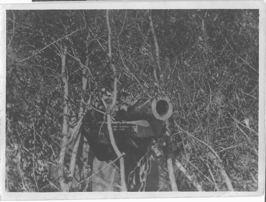
This picture is a little less opaque but it’s just as formally arranged, although I haven’t corrected/sharpened it for the screen here. The chaos pattern is a bit less obvious because the cannon is clearly the center of interest here, but it’s there. Except, this photograph strikes me as strangely posed. The thin, wiry trunks of the trees around the cannon look almost artificial.
I think they are.
I don’t mean they’re plastic — not in 1944-45. I mean they have been placed there. This is almost certainly an attempt at camouflage.
What if the first photograph is, too?
It would explain the strange triangular neatness in the middle of the frame. It looks like a cable or web of foliage held up or tied to the extant trees. Furthermore, since it’s highly likely this is in the South Pacific near Imperial Japanese expansion, camouflage would be useful for protecting against invasion of the islands and territories already under US control in World War Two. Exactly what would be beneath this camouflage is difficult to say, but it would certainly fit the same sort of ordnance that is hidden in the second photograph.
As always, I am left with a certain amount of speculation. But that simply means the picture retains some mystery. I prefer it that way. Much of the tedium of contemporary discussion and social network blather stems from an inability to accept mystery. Putting the uncertainty back into life makes me humble, a reminder that no matter how much I allegedly know, I can never know enough so it’s wise to listen and pay attention.
As the proverb goes, “Habits are at first cobwebs, at last cables.” The more they remain unacknowledged and unquestioned the harder they are to clear away, until finally they bind. Whether it’s mental habits like failing to consider alternatives or visual habits like failing to look beyond the superficial, the proverb holds true. Daily life for Americans consists of seven hours a day of decontextualized, remixed, ultimately vapid imagery from TikTok, Instagram, Twitter, Snapchat, and whatever else is next to arrive and distract. The distraction can be “nice,” but it’s a poor habit to cultivate. If people can’t deeply consider images overtly decided by human hands, they certainly won’t be able to consider deeply the fakery of AI and the hidden masters behind its generation.
